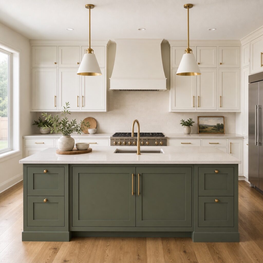
Two-tone kitchen cabinets feel intentional when the color change follows a clear architectural boundary—usually a freestanding island, a full pantry wall, or one complete cabinet zone. The room starts to feel busy when colors switch randomly, compete with a dramatic countertop, or divide one connected cabinet run without a visual reason.
The appeal is easy to understand. A second cabinet color can add depth, make an island feel more substantial, or bring warmth into a mostly light kitchen. The risk is that the eye begins counting finishes instead of seeing one calm room. A successful plan gives each color a job and lets the surrounding surfaces connect them.
Where should the cabinet color change happen?
The cleanest color break occurs where the kitchen already changes physically. An island reads as one complete object, so it can carry a stronger color without interrupting the perimeter. A bank of tall pantry cabinets can also become a separate visual block when it begins and ends clearly.
Changing color halfway through an uninterrupted wall is harder. If identical upper and lower cabinets share the same countertop and backsplash, an unexplained switch can make the elevation look assembled in pieces. The same problem appears when one random cabinet becomes an accent with no connection to the room’s layout.
Use the architecture as the rule
If someone can understand the color boundary without an explanation, the plan will usually feel more settled. If the change needs a long story to make sense, simplify it.
Which cabinet color should lead the room?
Choose one dominant color and one supporting color. The dominant finish should cover enough cabinetry to create visual continuity. The supporting finish can then anchor the island, frame a pantry wall, or add warmth to a defined section.
In many kitchens, warm white or soft greige works well on the perimeter because it keeps the room open and allows the backsplash and countertop to read clearly. A muted sage, charcoal, navy, taupe, or wood tone can give the island more presence. That is not a fixed formula, though. A room with strong daylight and a light floor may comfortably carry a deeper perimeter, while a smaller kitchen may benefit from keeping the darker color limited.
The useful question is not “Which two colors are popular?” It is “Which finish should visually organize the room, and where can the second finish add something the first cannot?”
How do countertops and floors connect two cabinet colors?
The countertop is often the bridge because it touches both cabinet finishes. A quiet warm-white quartz can connect soft-white perimeter cabinets with a green, blue, or wood island. A stone with strong veining may already be the kitchen’s main visual event, so a second assertive cabinet color can push the room past its balance point.
Floors matter for the same reason. Warm oak flooring can soften a deep painted island, while a cool gray floor may make some blue or charcoal finishes feel colder than expected. Backsplash, wall color, metal finishes, and appliances also influence how the pair reads.
| Existing condition | A calmer two-tone direction | What to watch |
|---|---|---|
| Busy or strongly veined countertop | Use two quiet cabinet colors with similar warmth | A high-contrast island may compete with the stone |
| Warm wood floor and simple light counter | Warm-white perimeter with muted green, taupe, or charcoal island | A blue-white perimeter can make the floor look more orange |
| Small kitchen with limited daylight | Keep the stronger color on one compact, complete zone | Dark uppers across the room can lower the visual ceiling |
| Large kitchen with a substantial island | Let the island carry the supporting color | Repeating that accent on random perimeter cabinets weakens the boundary |
Should the upper and lower cabinets be different colors?
They can be, but this horizontal split changes the whole room rather than highlighting one object. Dark lowers with light uppers can ground a kitchen and keep the upper half open. It works best when the cabinet lines are simple, the backsplash creates continuity, and tall cabinets are assigned deliberately.
Tall pantry and refrigerator cabinets need special attention because they cross both color zones. Painting half of a tall unit one color and half another rarely looks intentional. Usually the entire tall block should join either the upper color, the lower color, or a clearly defined third material only when the overall design supports it.
ColorUp maps the finish boundaries before production begins. The crew is responsible for documenting which doors, drawer fronts, panels, trim pieces, island faces, and cabinet-box surfaces receive each approved finish. Homeowners should not have to label or track parts; the scope and production system should keep the color assignment clear.
How should you test a two-tone cabinet palette?
Small paper chips are useful for narrowing choices, but they are not enough for the final decision. Cabinet colors are seen vertically, across a much larger area, beside fixed materials, and under changing light. View large finish samples near the island and perimeter in morning light, late-afternoon light, and the artificial lighting used at night.
Place both colors beside the countertop and floor at the same time. A pair that looks coordinated in isolation may reveal an undertone conflict when the stone is added. Also compare the proposed sheen. Two different colors can still feel connected when the finish quality and sheen level belong to the same system.
If the existing doors and boxes are appropriate to keep, professional cabinet painting can apply the planned color separation. If the color is not the only concern and the door profile also feels dated, cabinet refacing may create a cleaner foundation before the two-tone palette is finalized.
A simple decision framework for two-tone cabinets
Before committing, answer four questions in order:
- What is the boundary? Identify the island, pantry wall, upper/lower split, or other complete architectural zone.
- Which color leads? Decide which finish organizes most of the cabinetry and which one supports it.
- What connects them? Confirm that the countertop, floor, backsplash, and hardware relate naturally to both colors.
- Does the room need this contrast? If the stone, backsplash, and lighting already create several focal points, one cabinet color may be the stronger design decision.
This framework keeps a trend from becoming an automatic choice. A single-color kitchen can still have depth through hardware, wood accents, lighting, and countertop movement. Two-tone cabinetry earns its place when it makes the architecture clearer.
Compare one-color and two-tone cabinet plans in your kitchen
Share photos of the island, perimeter, countertops, and flooring. ColorUp can help you test where the color should change before the finish scope is finalized.
Request a Cabinet EstimateFrequently asked questions
Are two-tone kitchen cabinets going out of style?
A thoughtful color boundary is more durable than a trend-driven combination. When the island or another complete zone has a clear role, the kitchen can feel layered rather than dated. The exact colors should still relate to the home’s fixed materials.
Should the island be darker than the perimeter cabinets?
It often is, but it does not have to be. A darker island can anchor the room, while a light wood or softer painted island can warm a deeper perimeter. Room size, daylight, floor color, and countertop movement should guide the contrast.
Can wood and painted cabinets work together?
Yes. Wood can serve as the supporting finish when its undertone relates to the floor and countertop. Keep the species, stain direction, and painted color restrained so the combination looks deliberate rather than collected at random.
Do two cabinet colors need the same hardware?
Using one hardware finish is the simplest way to connect the two colors. Mixed metals can work when they repeat elsewhere in the room, but they add another decision and should not be used merely to make each cabinet color feel separate.
Can ColorUp show both options before we decide?
ColorUp can review the kitchen photos, fixed surfaces, cabinet condition, and finish goals during the estimate process. Large physical samples and a clearly written scope help compare a single-color direction with a two-tone plan before production approval.