Choose color, with confidence.
Color is often the last decision holding a kitchen project back. We narrow it by reading the surfaces that stay, the undertones that repeat, and the light that changes through the day.
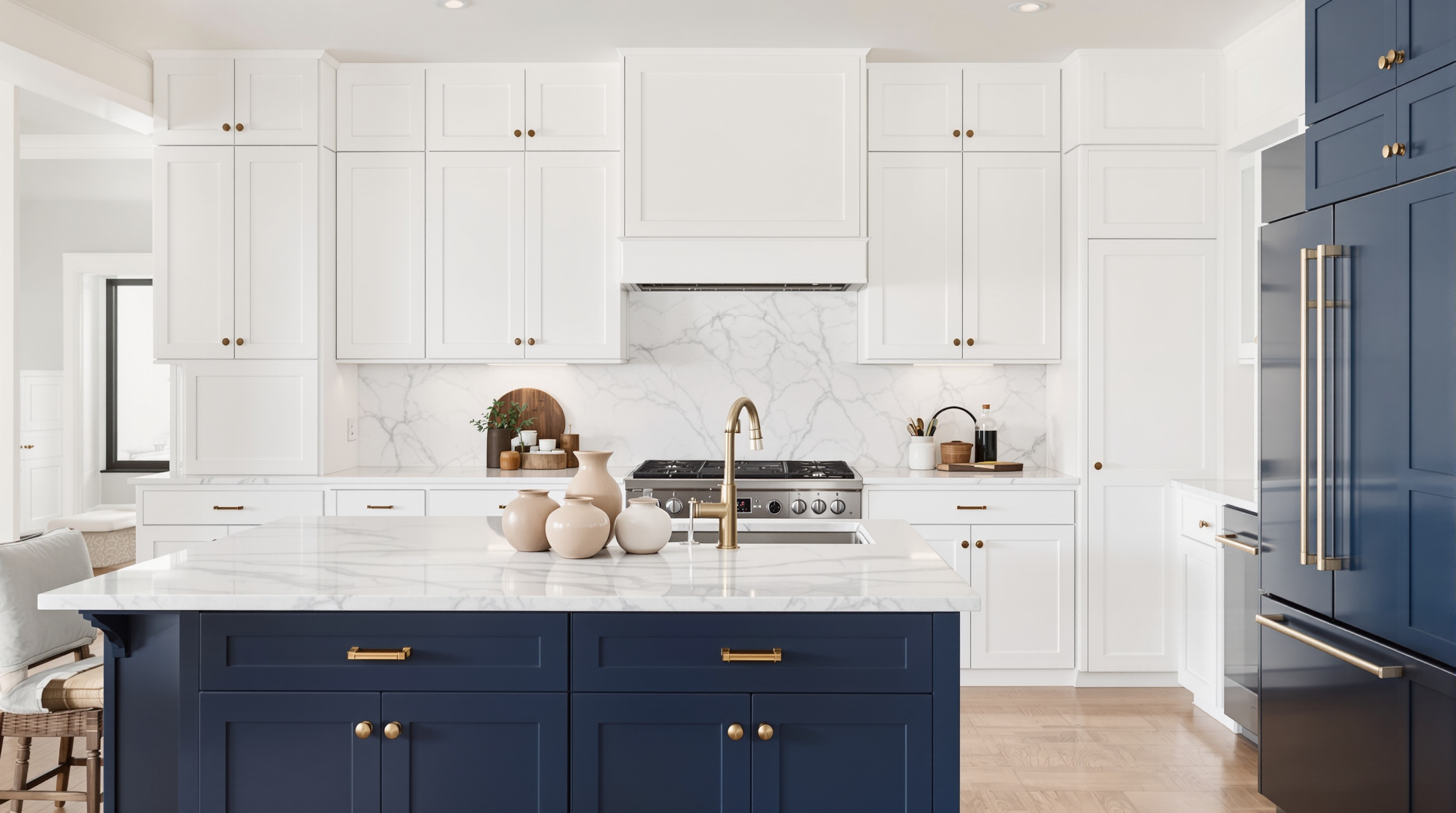
A color decision needs context.
A cabinet color is not approved in isolation. It is compared with the countertop, backsplash, floor, wall color, hardware, appliance finish, and natural light. The goal is not a perfect swatch. It is a room that still feels coherent from morning through evening.
Start with what stays.
Existing stone, flooring, and backsplash establish the undertones the new finish must respect.
Choose a direction.
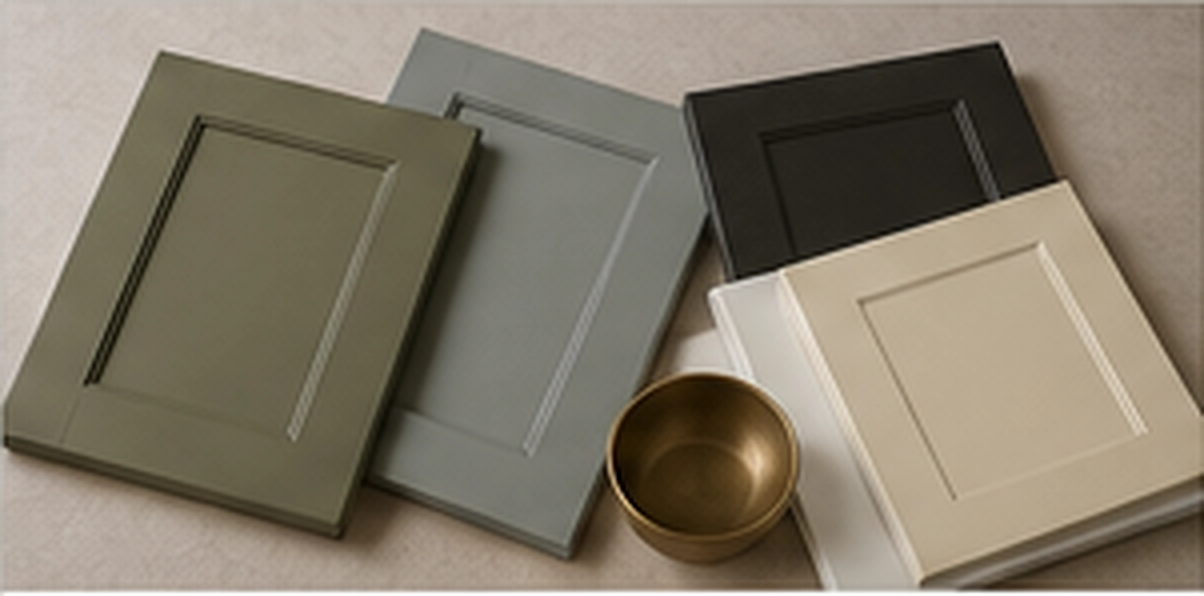
Warm white, quiet greige, muted green, deep charcoal, or natural wood creates the first useful shortlist.
Read changing light.
Samples are checked near windows, in shadowed runs, and under the bulbs used at night.
Use a full door.
A full-size finished door shows sheen, profile shadow, and color more honestly than a small paper chip.
Complementary colors without a formula.
Complementary does not always mean opposite on a color wheel. In a kitchen, it usually means shared undertones, deliberate contrast, and one surface quiet enough to let another lead.
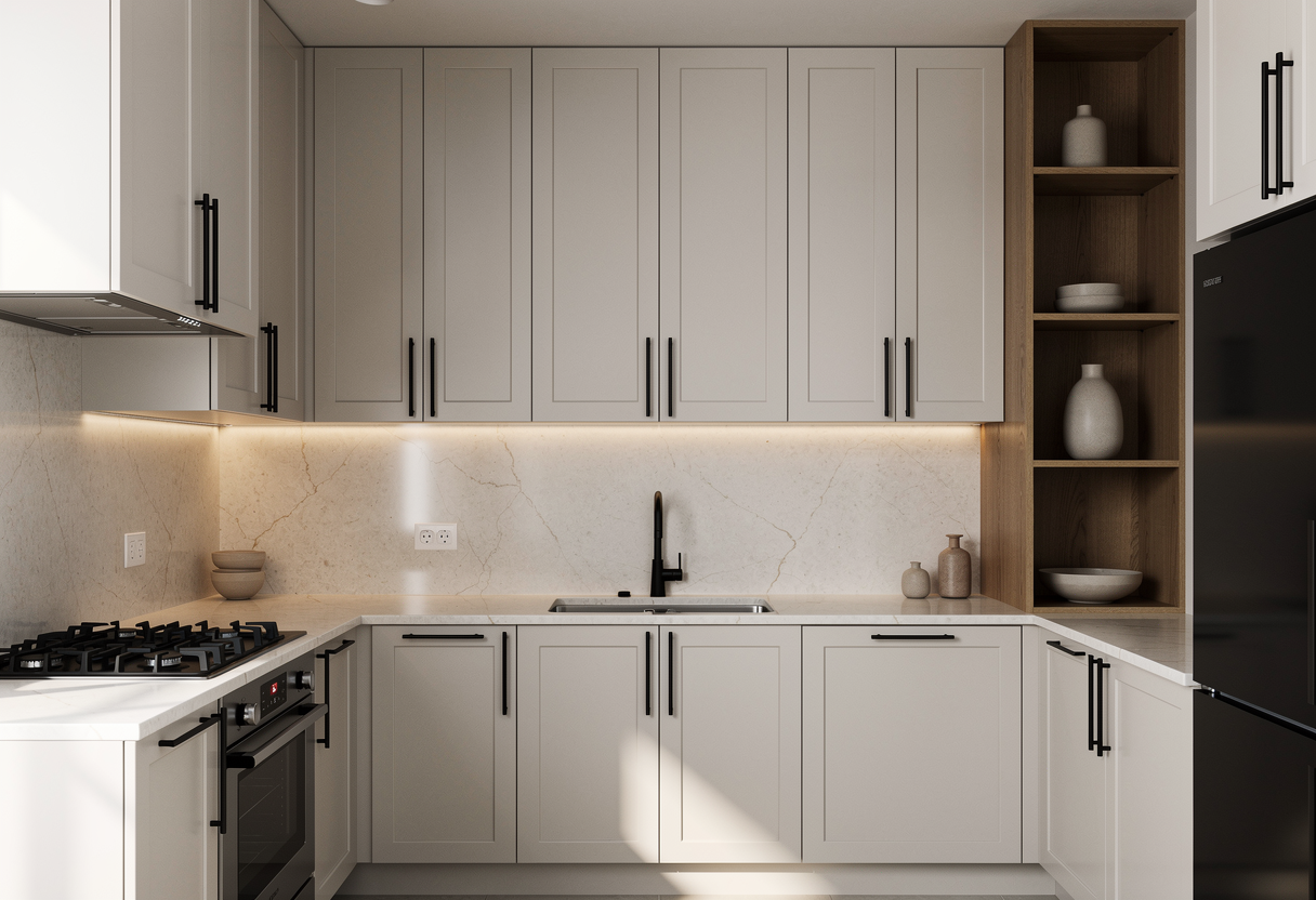
Warm white cabinets
Pair with soft greige or muted clay walls and stone that repeats a warm cream, taupe, or restrained gold vein.

Muted green cabinets
Keep walls warm and quiet. Choose stone with cream, taupe, or subtle olive movement instead of a blue-white ground.
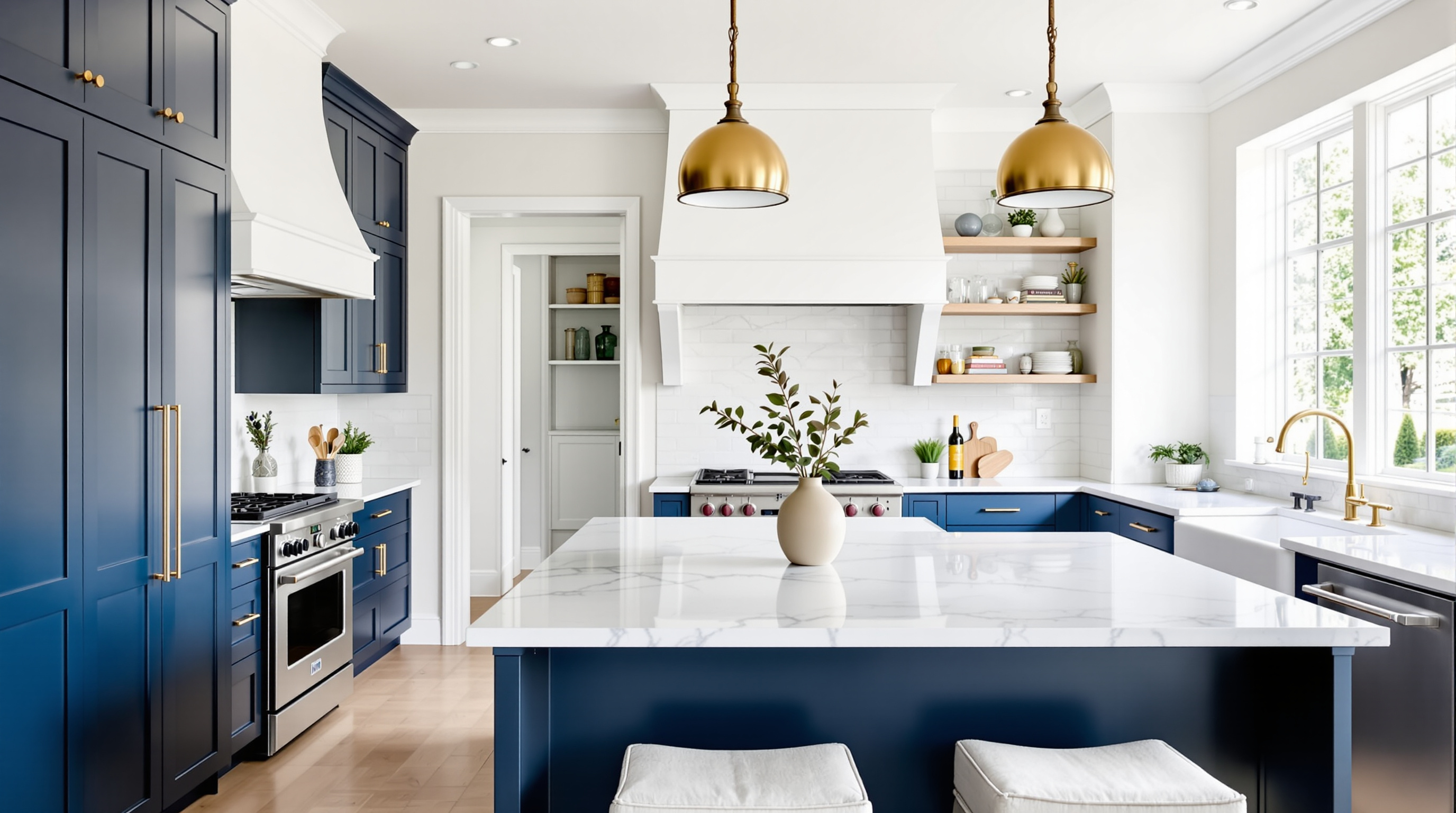
Deep charcoal or navy
Use lighter walls and counters to hold contrast. Repeat the cabinet depth in hardware, lighting, or a small architectural detail.
Cabinet color and countertop undertone.
The countertop often carries more movement than the cabinets. We identify its background color first, then decide whether the cabinet should blend quietly or create a controlled contrast.
| Countertop direction | What to notice | Cabinet direction to test | Wall relationship |
|---|---|---|---|
| Warm white quartz | Cream or taupe base, soft gold or gray movement | Warm white, putty, sage, charcoal | Keep the wall slightly quieter than the cabinet or stone |
| Cool white quartz | Blue-gray base or crisp gray veining | Cleaner white, restrained gray, deep navy | Avoid introducing a separate yellow undertone |
| Quartzite or marble | Dominant vein color and variation across the actual slab | Pull from the slab background, not the most dramatic vein | Use wall color to bridge cabinet and stone |
| Dark granite | Black, brown, green, or blue undertone | Lighter warm neutrals or a deliberate tonal dark | Protect enough contrast for the room’s natural light |
The same color, four moments.
Natural light changes direction and temperature. Morning can sharpen cool notes, midday can flatten subtle differences, late light can warm a neutral, and evening bulbs can reveal undertones that were quiet all day.
08:00 / MorningCooler and clearer
North and east light can make gray or blue undertones more visible.
12:00 / MiddayMost neutral
Strong daylight often shows the finish closest to its balanced reading.
17:30 / Late lightWarmer and softer
Warm sunlight can pull beige, olive, and gold notes forward.
20:00 / EveningBulbs take over
Warm LEDs can cream a white; cool LEDs can make the same finish feel sharper.
Questions that slow the decision down.
These are useful questions. The answer depends on the room, so each one becomes a comparison instead of a guess.
Should cabinet color match the wall color?
No. They should share a compatible undertone and have enough contrast to keep the cabinet profile visible. A near-match can work, but it should look intentional in both daylight and evening light.
Should cabinets or countertops be chosen first?
Start with the surface that is staying or has the least flexibility. When both are changing, narrow the countertop family and cabinet direction together before approving either one.
Why does the color look different at home?
Light direction, bulb temperature, floor color, wall color, and the size of the sample all affect perception. That is why the final comparison happens in your kitchen with a full-size sample.
Can the island be a different color?
Yes, when the island color has a relationship to the perimeter cabinets, countertop, floor, or hardware. Two-tone feels deliberate when one finish clearly leads and the other supports it.
Continue the finish decision.
Move from color direction into the tool that answers the next question.
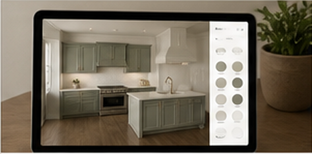
Bring the decision into your kitchen.
Book an in-home estimate for sample guidance, or send photos first when you are still narrowing the direction.