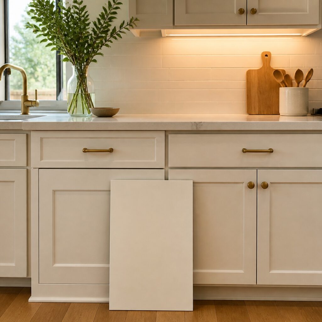
Cabinet Color Guide
By ColorUp Cabinets · Published August 20, 2026
Cabinet paint colors look different at night because the light source and the kitchen’s fixed finishes change which undertones your eye notices. Daylight may make a warm white feel balanced, while warm bulbs can push it toward cream or yellow. Cool LEDs can make the same sample look flatter, grayer, or slightly blue.
That shift does not mean the paint color changed. It means the room changed around it. Cabinet doors sit beside countertops, backsplash, flooring, appliances, and hardware, so the color is never viewed by itself. A sample that looks quiet in a paint store can behave very differently once it is vertical in the kitchen and the evening lights come on.
Why does cabinet paint color change from daylight to evening?
Natural daylight is broad and constantly changing. Morning light, direct afternoon sun, a cloudy sky, and shaded windows can each reveal color differently. At night, the room depends on bulbs and fixtures. Their warmth, brightness, location, and direction determine what the cabinet surface reflects.
A warm white may feel clean in bright daylight and noticeably creamier beneath warm under-cabinet lighting. A pale greige may look balanced during the day but cooler after sunset if the ceiling fixtures use cooler bulbs. Deep colors change too: navy, charcoal, and dark green can reveal more color in strong natural light and appear closer to black in dim corners.
The sample is not the whole decision
A cabinet color should be judged as part of the room: vertical, beside the permanent materials, and under the light the family actually uses in the morning and at night.
How do countertops, backsplash, and flooring affect cabinet color?
Fixed finishes create the color neighborhood around the cabinets. A quartz countertop may have a warm background even when it first reads as white. Stone veining can lean beige, gray, gold, or blue. Wood flooring can cast warmth upward, while a cool tile floor can make a neutral cabinet color feel sharper.
This is why choosing cabinets from a digital photograph is risky. Screens change brightness and color, and inspiration photos show someone else’s lighting and materials. The useful comparison happens in the actual kitchen, with the sample next to the surfaces that will remain.
If countertops are also changing, plan the cabinet and countertop palette in the same conversation. You do not need every decorative choice finalized, but you should understand which surface will carry more movement and which will stay quiet. A bold stone and a strongly tinted cabinet color may compete; a calmer cabinet color can give expressive veining more room.
Hardware and appliances influence the result too
Brass, bronze, black, polished nickel, and stainless steel reflect nearby colors differently. Appliances also create large cool or dark surfaces in the cabinet run. A cabinet sample should be viewed near these finishes rather than evaluated alone on a white sheet of paper.
Why do sheen and cabinet texture matter?
Sheen changes how much light travels across the surface. A more reflective finish can brighten a room and make a color feel livelier, but it can also make changing light more noticeable across a long row of doors. A lower sheen often appears softer and more forgiving, although the correct finish still needs to suit cabinet use and the selected coating system.
Door texture matters as well. Open wood grain, routed profiles, repairs, and broad flat panels catch highlights and shadows differently. Two doors painted the same color can appear slightly different when one reflects a fixture directly and the other faces away from it. That is a lighting effect, not necessarily a color-matching problem.
A professional cabinet painting conversation should connect color and sheen to the cabinet material, condition, daily use, and room—not reduce the decision to a small swatch and a paint name.
How should you evaluate a cabinet color in your kitchen?
You do not need dozens of samples. A short, deliberate comparison is usually more useful than covering every door with a different white.
A practical color decision framework
- Start with what is staying. Identify the countertop, backsplash, flooring, wall color, appliances, and hardware that the new cabinet finish must live beside.
- Narrow the direction. Decide whether the room needs warmth, contrast, softness, or a stronger anchor before comparing nearly identical paint names.
- Use a larger vertical sample. Cabinet doors face the room vertically, so a sample lying flat on a counter does not receive light the same way.
- Look more than once. Check the sample in morning daylight, afternoon conditions, and after sunset with the normal kitchen lights turned on.
- Compare the whole palette. Move the sample beside stone, tile, flooring, metals, and nearby painted walls instead of judging it against an empty background.
- Choose the room, not the photograph. Let saved images define a direction, then let the actual kitchen make the final decision.
The homeowner’s role is to decide how the room should feel and to evaluate the sample in daily conditions. ColorUp’s crew handles the production work: door tracking, preparation, repairs, protection, coating, and reinstallation. Homeowners should not have to manage a cabinet-finishing checklist to get a coordinated result.
What is different about choosing cabinet color in Greater Houston?
Greater Houston homes can receive intense daylight, deep covered-patio shade, and a very different mood after sunset. Open plans also allow colors from living areas, floors, and large windows to influence the kitchen. A color that works beautifully in one Houston home may miss the mark in another with the same cabinet style but different exposure and finishes.
The goal is not to find a universally perfect white, greige, green, or blue. It is to find the color that stays convincing through the lighting conditions and materials in your kitchen.
Frequently asked questions
Why does my white cabinet sample look yellow at night?
Warm bulbs, warm flooring, creamy countertops, and nearby wood can make yellow or cream undertones easier to see after sunset. Compare the sample under the bulbs you intend to keep before finalizing it.
Can changing light bulbs fix a cabinet color problem?
Sometimes lighting is part of the issue, but bulbs should not be changed just to rescue a color that conflicts with the room. First decide whether the current lighting serves the kitchen well. Then evaluate the cabinet sample under the lighting plan that will actually remain.
Should I test cabinet paint on a wall?
A wall can help reveal undertones, but it is not a perfect substitute for a cabinet surface. Walls and doors receive light at different angles, and cabinet sheen can change reflection. A larger vertical sample near the cabinetry and fixed finishes gives a more relevant comparison.
Do dark cabinet colors also change at night?
Yes. Deep blues, greens, charcoals, and browns may show more of their undertone in strong daylight and appear much darker under limited evening light. Check shadowed areas as well as the brightest part of the kitchen.
Should the cabinet color match the countertop exactly?
No. The colors should relate, but an exact match is neither required nor always desirable. The cabinet can support a countertop’s undertone, create intentional contrast, or provide a quieter background for stone with more movement.
Choose the cabinet color in the room where it has to live
ColorUp can review your cabinets, fixed finishes, lighting, and project scope so the finish decision makes sense from morning through evening.
Request a Kitchen Estimate