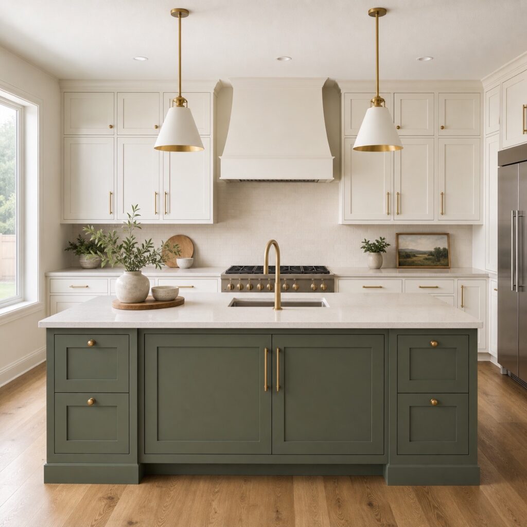
Best Cabinet Paint Colors for 2026: A Houston Pro’s Guide to What’s Trending
From warm whites and earthy greens to bold navy and dramatic black — these are the cabinet colors Houston homeowners are choosing right now, and the ones that will look great for years to come.
Choosing the Right Color Is the Hardest Part
After refinishing hundreds of kitchens across Houston, we can tell you this with confidence: picking the color is the part homeowners agonize over the most. Not the cost, not the timeline — the color. And honestly? We get it. Your cabinets are the single largest visual element in your kitchen. The color you choose sets the entire mood of the room.
The good news is that 2026 is one of the most versatile years for cabinet colors we’ve ever seen. There’s no single “it” color forcing everyone into the same look. Instead, there’s a range of beautiful options — from timeless neutrals to bold statement tones — and the best choice depends on your kitchen’s lighting, your countertops, your personal style, and how long you plan to stay in the home.
Here’s our breakdown of the best cabinet paint colors for 2026, straight from the people who spray them every day. At ColorUp Cabinets, we can do any color you want using our Toucan Touch process and premium Italian coatings — so this isn’t about what we can offer. It’s about what will look best in your kitchen.
The 7 Best Cabinet Paint Colors for 2026
1. Classic White
White cabinets are not going anywhere. They’ve topped the most popular cabinet colors list for over a decade, and 2026 is no different. White makes kitchens feel larger, brighter, and cleaner — and it pairs with literally every countertop, backsplash, and flooring material out there.
Best for: Small kitchens that need to feel bigger, open-concept layouts, homes being prepped for resale, and anyone who wants a timeless foundation they can accessorize with hardware and decor.
Style match: Transitional, modern farmhouse, coastal, contemporary — white works in every style.
2. Warm Whites (Swiss Coffee, Alabaster, White Dove)
Here’s the real trend for 2026: the shift from bright, sterile white to warm, creamy whites. Colors like Benjamin Moore Swiss Coffee, Sherwin-Williams Alabaster, and Benjamin Moore White Dove have taken over. They still read as “white” from across the room, but up close they have a soft warmth that feels lived-in and inviting rather than clinical.
Warm whites are especially stunning here in Houston, where our natural light tends to be warm and golden. A bright white can look slightly blue or harsh in certain north-facing kitchens, but a warm white just glows.
Best for: Kitchens with warm-toned countertops (quartz with gold veining, butcher block, warm marble), brass or gold hardware, and spaces where you want a soft, welcoming atmosphere.
Style match: Modern organic, transitional, European-inspired, California casual.
3. Sage Green and Hunter Green
Green has been building momentum for the past few years, and in 2026 it’s firmly established as the go-to color for homeowners who want something beyond neutral. Sage green (think Sherwin-Williams Evergreen Fog or Benjamin Moore October Mist) is the most popular shade — it’s soft enough to feel neutral but interesting enough to give your kitchen real personality.
For bolder homeowners, hunter green and deep olive tones are making a splash on kitchen islands and lower cabinets. These deeper greens feel rich and grounded, especially when paired with brass hardware and natural stone.
Best for: Kitchen islands (pair sage or hunter green lowers with white uppers), full kitchen repaints in homes with plenty of natural light, and kitchens with earthy or natural design elements.
Style match: Modern farmhouse, English cottage, organic modern, craftsman, mid-century.
Can’t Decide on a Color? We’ll Help.
During your free estimate, we bring color samples and can spray test boards in your kitchen so you see exactly how each color looks in your lighting. No guessing.
Schedule My Free Estimate4. Navy Blue
Navy blue is the color for homeowners who want drama without risk. It’s bold enough to make a statement but classic enough that it won’t feel dated in five years. Think Sherwin-Williams Naval or Benjamin Moore Hale Navy — deep, saturated blues that feel elegant and sophisticated.
Navy works particularly well as a two-tone approach: navy lowers with white or warm white uppers. It grounds the kitchen and gives the room a layered, designer look without overwhelming the space.
Best for: Two-tone kitchens (navy lowers, white uppers), large kitchen islands, butler’s pantries, and homeowners who love a classic, slightly nautical or preppy vibe.
Style match: Coastal, Hampton style, traditional, transitional, modern classic.
5. Warm Gray and Greige
The white vs gray cabinets debate has evolved. Cool gray — the shade that dominated the mid-2010s — has lost its edge. In its place, warm grays and greige (gray + beige) tones have stepped in. Colors like Sherwin-Williams Repose Gray, Benjamin Moore Revere Pewter, and Sherwin-Williams Agreeable Gray offer a sophisticated neutral that feels warmer and more organic than the blue-grays of years past.
Greige cabinets are an excellent middle ground for homeowners who find white too plain but aren’t ready for a bold color. They’re also incredibly versatile with both warm and cool countertop materials.
Best for: Homeowners who want something different from white but still neutral, kitchens with mixed metal hardware, and spaces with cool-toned flooring that needs a warmer cabinet to balance it out.
Style match: Contemporary, transitional, Scandinavian, modern minimalist.
6. Black
Black cabinets are not for everyone — and that’s exactly the point. For homeowners who want high-contrast, magazine-worthy drama, black delivers like nothing else. Whether it’s a true matte black or a softer charcoal-black like Benjamin Moore Onyx or Sherwin-Williams Tricorn Black, dark cabinets create an incredible focal point.
The key to making black work is contrast. Pair black cabinets with white or light marble countertops, lighter backsplash tile, and brass or gold hardware. Without that contrast, an all-dark kitchen can feel like a cave — especially in smaller spaces.
Best for: Large kitchens with abundant natural light, kitchen islands paired with white perimeter cabinets, modern and industrial-style homes, and homeowners who want a showstopper kitchen.
Style match: Modern, industrial, contemporary, art deco, high-contrast traditional.
7. Natural Wood Tones (The Staining Comeback)
After years of everything being painted, natural wood is back in a big way. But this isn’t the orange-toned oak of the 1990s. The 2026 staining trend is all about warm, rich tones — think white oak, walnut-inspired stains, and honey-toned finishes that let the natural wood grain show through.
At ColorUp, our cabinet staining service uses the same Toucan Touch process to deliver a flawless stained finish. We can match virtually any wood tone you’re after, from light cerused oak to deep espresso.
Best for: Homeowners who love natural materials, kitchens with stone countertops and organic textures, mixed material designs (stained island with painted perimeter), and anyone tired of the “everything painted white” look.
Style match: Organic modern, Japanese-inspired, Scandinavian, rustic contemporary, craftsman.
How to Choose the Right Cabinet Color for Your Kitchen
5 Tips from Our Team
- Start with your countertops and backsplash. These are expensive to change. Pick a cabinet color that complements what you already have (or what you plan to install). Warm countertops pair best with warm whites and greens. Cool-toned stone works with greige, navy, or bright white.
- Test colors in your actual kitchen lighting. A color that looks perfect on a screen or in a store can look completely different under your kitchen’s lighting. North-facing kitchens make cool colors look cooler. South-facing rooms warm everything up. We bring color samples to every consultation so you can see them in person.
- Think about resale value — but don’t let it paralyze you. If you’re selling in the next year, stick with warm white or light greige. If you’re staying for 5+ years, pick a color you love. You’ll enjoy your kitchen every day, and a professional finish in any color adds value.
- Consider the two-tone approach. Can’t decide between white and a color? You don’t have to. A colored island with white perimeter cabinets (or vice versa) gives you the best of both worlds. It’s the most popular approach we see in 2026 Houston kitchens.
- Don’t forget the finish matters as much as the color. Even the most beautiful color will look cheap if the finish isn’t right. Brush marks, roller texture, and uneven coverage ruin any color choice. That’s why professional cabinet painting with sprayed Italian coatings makes such a difference — the color shines when the finish is flawless.