Cabinet and countertop design guide
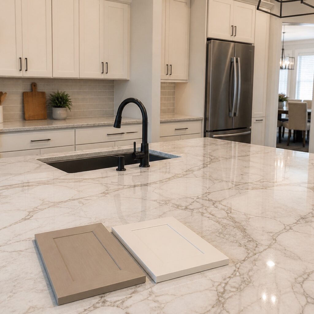
When a countertop has strong veining or movement, the safest cabinet color is usually a quieter tone that supports the stone instead of competing with it. Start by identifying the countertop’s background color and undertone, then compare cabinet samples beside a large section of the slab in the kitchen’s actual light.
A dramatic countertop can become the visual lead of a kitchen. The problem begins when the cabinet color, backsplash, hardware, and stone all try to lead at the same time. Each choice may look attractive by itself, yet the finished room can feel busy because there is no clear hierarchy.
Homeowners do not need to solve this with tiny samples or guess which white is “neutral.” ColorUp helps evaluate the fixed surfaces, cabinet condition, available light, and desired mood, then coordinates the cabinet and countertop direction before the production scope is finalized.
Choose which surface should lead the room
A kitchen usually feels more intentional when one surface carries the strongest pattern or color and the others support it. If the countertop has bold veining, high contrast, or noticeable movement, it is already making a statement across a large horizontal area. Quieter cabinets give that pattern room to breathe.
If the cabinets are meant to carry a deep green, charcoal, navy, or another strong color, a calmer countertop may create the better balance. There is no rule that cabinets must always be light. The useful rule is that every major surface should not demand equal attention.
The cabinet color does not need to copy the countertop. It should share a compatible undertone and support the role you want the stone to play in the room.
Read the countertop before choosing the cabinet paint
Begin with the stone’s background rather than its most dramatic vein. A slab that appears white from across the showroom may carry a warm cream, soft gray, taupe, or slightly green background when viewed up close. That background touches every cabinet run and often matters more than one bold line in the pattern.
Next, notice the contrast. Fine, low-contrast movement behaves differently from wide charcoal or gold veining. A busier slab may benefit from cabinets with less chromatic intensity and a restrained sheen. A quieter quartz or natural stone can support more cabinet color without making the room feel overloaded.
Finally, look at the whole slab or the largest sample available. A small chip cannot show the rhythm, spacing, or direction of the veining. For countertop planning, the pattern across several feet is part of the design decision.
Choose a cabinet color direction that supports the stone
Warm-white or soft-cream cabinets often work with countertops that carry beige, gold, or warm gray notes. A cooler white can make those same undertones appear yellow by comparison. Stone with crisp gray or charcoal movement may work with a cleaner white, a muted greige, or a deeper cabinet color when the room has enough light and visual breathing room.
Wood tones can also quiet a dramatic countertop. Natural white oak or a controlled stained finish adds warmth and texture without introducing another painted color. The existing cabinet material determines whether staining is realistic; if the current doors are not suitable, cabinet refacing may offer a different door or wood direction while preserving sound cabinet boxes.
For a painted finish, the goal is not to find a color name that sounds right online. A professional cabinet painting plan should connect the selected color and sheen to the countertop, backsplash, flooring, appliances, and light already present in the room.
Test cabinet samples in the light where they will live
Greater Houston kitchens can shift noticeably between bright daylight, cloudy afternoons, and warm evening lighting. A cabinet sample that looks calm near a showroom window may appear cooler, darker, or more yellow beside the installed countertop at home.
Compare a large cabinet sample vertically, because cabinet doors reflect light differently than a chip lying flat. Place it beside the countertop during morning and evening conditions. If the counters are not installed yet, compare the sample with the actual slab or a representative large sample and review photographs of the kitchen’s fixed finishes.
Sheen matters as well. More reflection can increase contrast and call attention to texture, while a restrained sheen can make a busy combination feel calmer. The finish system still needs to be appropriate for cabinetry; sheen is a design decision within that professional system, not a substitute for it.
Let the backsplash and hardware play supporting roles
Once the countertop and cabinets are coordinated, resist the urge to add a second competing pattern in the backsplash. A simple field tile, a quiet slab continuation, or another restrained surface often allows the countertop movement to remain the focal point. The exact choice depends on the architecture and the surfaces that are staying.
Hardware can repeat a metal already present in the faucet, lighting, or appliances, but it does not have to match every metal exactly. What matters is that the scale, finish, and placement feel deliberate across the cabinet grid. When hardware changes are part of the project, those decisions should be made before cabinet finishing so existing holes and the final layout can be addressed in the professional scope.
A simple cabinet-and-countertop decision framework
| What you see in the countertop | Cabinet direction to explore | What to verify |
|---|---|---|
| Bold, high-contrast veining | Quiet warm white, soft neutral, or controlled wood tone | Background undertone and whole-slab movement |
| Warm cream, beige, or gold notes | Warm white, cream, taupe, or compatible wood | Whether a cool cabinet sample makes the stone look yellow |
| Cool gray or charcoal movement | Clean white, muted greige, or a balanced deeper color | Natural light, evening light, and total cabinet coverage |
| Quiet, low-contrast surface | More freedom for cabinet color or two-tone planning | Flooring, backsplash, and adjoining-room colors |
| Countertop is not selected yet | Decide whether cabinets or stone will be the visual lead | Large samples together before either finish is finalized |
This framework narrows the conversation; it does not replace reviewing the actual kitchen. Cabinet coverage, ceiling height, window direction, flooring, and adjacent rooms all change how the same combination reads.
What ColorUp handles during the planning and production process
ColorUp evaluates the cabinet material and condition, reviews the fixed surfaces, and helps compare cabinet finish directions with the countertop plan. When countertop work belongs in the scope, the project should clearly define selections, fabrication, installation, sink considerations, and the sequence between trades.
Once the approved direction is established, the crew handles the cabinet production responsibilities included in the proposal: removal and tracking, cleaning, preparation, repairs in scope, coating, protection, and reinstallation. The homeowner should be making informed design and scope decisions—not managing the crew’s labeling, masking, sanding, or spraying checklist.
Frequently asked questions
Should cabinets be lighter than the countertop?
No. Cabinets can be lighter, similar in value, or darker. The better choice depends on the countertop’s contrast, total cabinet coverage, room light, and which surface is intended to lead the design.
Do white cabinets work with a busy countertop?
Often, yes, but the undertone matters. A warm-white cabinet may support cream or gold movement, while a cleaner white may fit cooler gray stone. Compare large samples in the kitchen rather than choosing by color name.
Can I use a bold cabinet color with dramatic stone?
You can, especially on an island or smaller cabinet area, but the rest of the palette should be controlled. Review the combination across the full room so the contrast feels intentional rather than crowded.
Should the backsplash match the countertop veining?
It does not need to copy the veining. A quieter backsplash often works better when the countertop already carries strong movement. The surfaces should share compatible undertones and a clear visual hierarchy.
Which should be selected first: cabinets or countertops?
If one surface is already staying, let it guide the other. When both are changing, decide which will be the visual lead, then compare the cabinet finish and full countertop pattern together before final approval.
Compare your cabinet and countertop choices together
Send ColorUp photos of the kitchen and the surfaces you are considering. We will help you evaluate cabinet painting, refacing, and countertop options as one coordinated plan.
Request a project estimatePrepared by ColorUp Cabinets for Greater Houston homeowners planning cabinet and countertop updates. Updated August 27, 2026.