Two-Tone Kitchen Cabinets Are Two-Tone Cabinet Color Planning in 2026
Houzz data confirms it: two-tone cabinets topped every other kitchen update request this year. Here’s exactly how to do it right — colors, costs, and all.
Why Two-Tone Cabinets Took Over Houston Kitchens in 2026
Houzz surveyed thousands of homeowners for its 2025 Kitchen Trends Report. Two-tone cabinets came out on top — the #1 most-requested kitchen design feature heading into 2026.
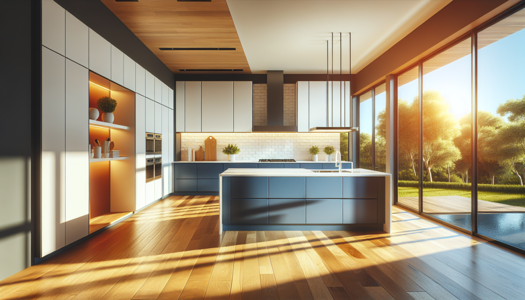
That’s not a coincidence. Houston homes are built for this look. Open-concept layouts, high ceilings, and strong natural light from big windows give the contrast room to breathe. The result feels deliberate, not busy.
And here’s the practical part: you don’t need new cabinets to pull it off. If your existing boxes are solid, a professional refinishing job gets you there for a fraction of new cabinet cost.
The Rule That Makes Two-Tone Work Every Time
Most two-tone mistakes come down to undertones. Every paint color has a hidden temperature — warm (yellow, red, brown) or cool (blue, gray, green). When you put a warm color next to a cool one, they fight each other. Especially in Houston’s bright natural light.
The rule is simple: warm with warm, cool with cool. Unless you’re going for a deliberate high-contrast look — in which case, lean into it fully.
The Three Two-Tone Formulas That Work
| Formula | Upper Cabinet | Lower Cabinet | Best For |
|---|---|---|---|
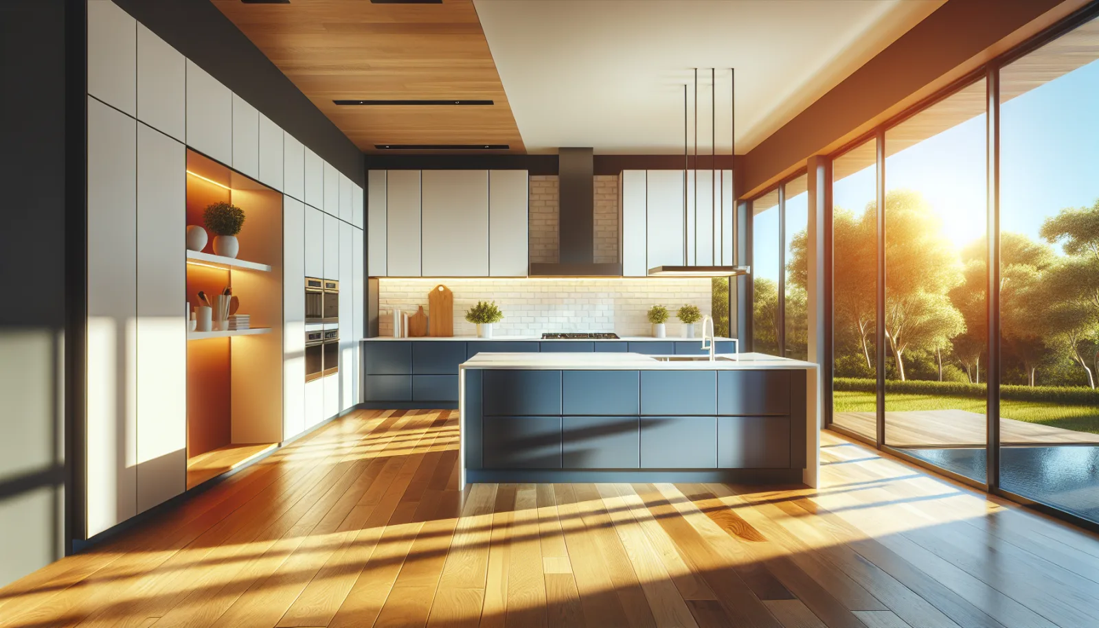
| Classic Contrast | Crisp white or off-white | Deep navy or charcoal | High ceilings, lots of natural light |
| Warm Tonal | Creamy white or warm greige | Sage green or warm taupe | Wood floors, warm countertops |
| Soft Depth | Light gray or pale blue-gray | Slate blue or stormy blue-green | Modern or transitional Houston homes |
Houston gets intense direct sunlight through south and west-facing windows. Warm whites can look almost yellow in afternoon light. Always test your paint samples at different times of day before committing to a color — especially on lower cabinets where the color reads at eye level.
The Best Paint Color Pairings for Houston Homes
These are real combinations we recommend — specific colors from Benjamin Moore and Sherwin-Williams that hold up well in Houston’s bright, warm light.
Chantilly Lace + Naval
Benjamin Moore Chantilly Lace (OC-17) on the uppers. Sherwin-Williams Naval (SW 6244) on the lowers. Chantilly Lace is a true, clean white with no yellow — it reads crisp next to the deep blue of Naval. Both have cool undertones, so they’re naturally compatible. Works beautifully with white quartz and gray or white subway tile.
White Dove + Sage Green
Benjamin Moore White Dove (OC-17) on the uppers. Sherwin-Williams Rosemary (SW 6187) or Benjamin Moore October Mist (1495) on the lowers. White Dove has a warm, creamy tone that pairs naturally with earthy sage greens. Popular in Sugar Land and Katy homes with warm wood floors and beige or cream countertops.
Repose Gray + Iron Ore
Sherwin-Williams Repose Gray (SW 7015) on top. Sherwin-Williams Iron Ore (SW 7069) on the bottom. This pairing skips the traditional white entirely — both are cool-toned neutrals, just at opposite ends of the spectrum. Works especially well in modern homes in The Heights or Midtown with stainless appliances and concrete-look countertops.
How to Decide Which Cabinets Get Which Color
The general rule: lighter color on top, darker on the bottom. This mirrors how light and shadow work in nature. It feels visually grounded and keeps the kitchen from feeling top-heavy.
But there’s a practical reason too. Lower cabinets take more abuse — cooking splatter, kids, cleaning products. Darker colors hide wear better and require less frequent touch-ups.
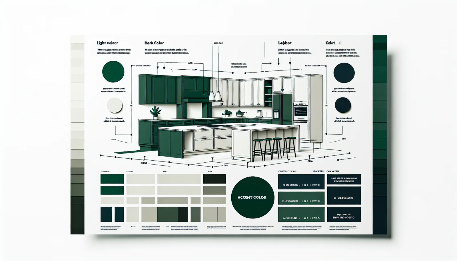
If you have a tall pantry cabinet that runs floor to ceiling, treat it as an upper. Paint it the lighter color so it doesn’t create a dark vertical stripe that cuts the kitchen in half visually. Same goes for any cabinets flanking the refrigerator.
The Island: The Easiest Entry Point Into Two-Tone
Not ready to commit to two full cabinet colors throughout the kitchen? Start with the island.
The island is visually separate from the perimeter cabinets. That separation makes an accent color feel natural instead of forced. It’s the lowest-risk way to try two-tone — and honestly, it’s often the most impactful.
Full Two-Tone
- Upper + lower cabinets in two colors
- Maximum visual impact
- Best for open-concept layouts
- Schedule confirmed in writing
- Requires more color planning
Island Accent Only
- Island in accent color, perimeter one color
- Lower commitment, still high impact
- Works in any kitchen size
- Easier color decision
- Great first step into two-tone
Full two-tone usually lands inside our $3,500–$9,000 painting range; island-only accents can start lower as a smaller scope. Written proposal controls.
Popular island accent colors right now: Naval (SW 6244), Rookwood Dark Green (SW 2809), Black Magic (SW 6991), and Benjamin Moore Newburyport Blue (HC-155). All pair well with white or off-white perimeter cabinets.
Two-Tone With Existing Countertops and
Want to See What Two-Tone Looks Like in Your Kitchen?
We include a complimentary color consultation with every free estimate for Houston homeowners. Send us your cabinet photos and we’ll show you two-tone combinations that actually work with your countertops and lighting.
Get My Free Estimate
Text Us Now
Frequently Asked Questions
Are two-tone kitchen cabinets still in style in 2026?
Yes — they’re more popular than ever. Houzz’s 2025 Kitchen Trends Report ranked two-tone cabinets as the #1 most-requested kitchen design feature going into 2026. The look has moved well past trend status into a mainstream design choice, especially in Houston where open-concept kitchens make the contrast easy to pull off.
What is the most popular two-tone cabinet combination?
The most popular pairing in 2026 is white or off-white upper cabinets with a deep navy or forest green on the lowers. Sherwin-Williams Naval (SW 6244) on the bottom with Benjamin Moore Chantilly Lace (OC-17) on top is one of the most requested combos we see in Houston. Warm greige uppers with a rich walnut-toned lower is a close second, especially in homes with warm wood floors.
Should the island be a different color than the cabinets?
It’s one of the easiest and lowest-commitment ways to try two-tone. The island sits apart from the perimeter cabinets, so giving it a contrasting color feels natural — not forced. A navy or deep green island against white perimeter cabinets is a proven combination. It also adds visual weight to the center of the kitchen, which makes the whole space feel more intentional.
Does two-tone cabinet painting cost more than single color?
Usually somewhat more. Two-tone adds masking between colors, a second color setup, and added dry time, and the written proposal states the price and schedule. Most full-kitchen painting projects, including two-tone, plan between $3,500 and $9,000 depending on cabinet count and layout.
What colors go well together for two-tone cabinets?
The rule is: warm with warm, cool with cool — unless you’re going for high contrast intentionally. Off-white uppers with navy lowers works because both have cool undertones. Creamy white uppers with sage green lowers works because both lean warm. Where people go wrong is pairing a cool bright white with a warm brown-green — the undertones fight each other and it looks off in natural light.
Can you do two-tone with existing cabinets?
Absolutely. You don’t need new cabinets at all. As long as the cabinet boxes are structurally sound, a professional refinishing company like ColorUp Cabinets can paint your existing upper and lower cabinets in two different colors. The doors and drawer fronts get removed, sprayed off-site, and reinstalled — giving you a near-factory finish without the cost of replacement.
Can wood and painted cabinets work together?
Yes. Wood can serve as the supporting finish when its undertone relates to the floor and countertop. Keep the species, stain direction, and painted color restrained so the combination looks deliberate rather than collected at random.
Do two cabinet colors need the same hardware?
Using one hardware finish is the simplest way to connect the two colors. Mixed metals can work when they repeat elsewhere in the room, but they add another decision and should not be used merely to make each cabinet color feel separate.
Can ColorUp show both options before we decide?
ColorUp can review the kitchen photos, fixed surfaces, cabinet condition, and finish goals during the estimate process. Large physical samples and a clearly written scope help compare a single-color direction with a two-tone plan before production approval.
Want to See What Two-Tone Looks Like in Your Kitchen?
We include a complimentary color consultation with every free estimate for Houston homeowners. Send us your cabinet photos and we’ll show you two-tone combinations that actually work with your countertops and lighting.
Get My Free Estimate Text Us NowAre two-tone kitchen cabinets still in style in 2026?
Yes — they’re more popular than ever. Houzz’s 2025 Kitchen Trends Report ranked two-tone cabinets as the #1 most-requested kitchen design feature going into 2026. The look has moved well past trend status into a mainstream design choice, especially in Houston where open-concept kitchens make the contrast easy to pull off.
What is the most popular two-tone cabinet combination?
The most popular pairing in 2026 is white or off-white upper cabinets with a deep navy or forest green on the lowers. Sherwin-Williams Naval (SW 6244) on the bottom with Benjamin Moore Chantilly Lace (OC-17) on top is one of the most requested combos we see in Houston. Warm greige uppers with a rich walnut-toned lower is a close second, especially in homes with warm wood floors.
Should the island be a different color than the cabinets?
It’s one of the easiest and lowest-commitment ways to try two-tone. The island sits apart from the perimeter cabinets, so giving it a contrasting color feels natural — not forced. A navy or deep green island against white perimeter cabinets is a proven combination. It also adds visual weight to the center of the kitchen, which makes the whole space feel more intentional.
Does two-tone cabinet painting cost more than single color?
Usually somewhat more. Two-tone adds masking between colors, a second color setup, and added dry time, and the written proposal states the price and schedule. Most full-kitchen painting projects, including two-tone, plan between $3,500 and $9,000 depending on cabinet count and layout.
What colors go well together for two-tone cabinets?
The rule is: warm with warm, cool with cool — unless you’re going for high contrast intentionally. Off-white uppers with navy lowers works because both have cool undertones. Creamy white uppers with sage green lowers works because both lean warm. Where people go wrong is pairing a cool bright white with a warm brown-green — the undertones fight each other and it looks off in natural light.
Can you do two-tone with existing cabinets?
Absolutely. You don’t need new cabinets at all. As long as the cabinet boxes are structurally sound, a professional refinishing company like ColorUp Cabinets can paint your existing upper and lower cabinets in two different colors. The doors and drawer fronts get removed, sprayed off-site, and reinstalled — giving you a near-factory finish without the cost of replacement.
Can wood and painted cabinets work together?
Yes. Wood can serve as the supporting finish when its undertone relates to the floor and countertop. Keep the species, stain direction, and painted color restrained so the combination looks deliberate rather than collected at random.
Do two cabinet colors need the same hardware?
Using one hardware finish is the simplest way to connect the two colors. Mixed metals can work when they repeat elsewhere in the room, but they add another decision and should not be used merely to make each cabinet color feel separate.
Can ColorUp show both options before we decide?
ColorUp can review the kitchen photos, fixed surfaces, cabinet condition, and finish goals during the estimate process. Large physical samples and a clearly written scope help compare a single-color direction with a two-tone plan before production approval.